Linguist PD online courses
Course branding for online courses and web banners
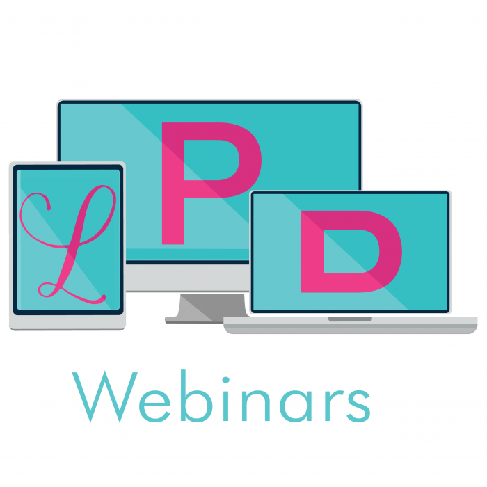
My client needed a logo for online courses and webinars that she provides through her website. She has a very specific taste and wanted her love for pink and turquoise to be brought into the logo. It needed to be professional and clean to appeal to the target audience of professionals, yet also maintain a fun, fresh feel to it. Out of all my sketches, she loved the devices concept to depict that the courses are available on any device, anywhere you take them. These webinars are training provided for deaf people and are signing based video training for professional development.
We created a few web banners too, which are used throughout the courses, online marketing and her website.
- CLIENT Linguist PD
- YEAR 2017
- CATEGORY Branding , Digital Design
- TAGS


