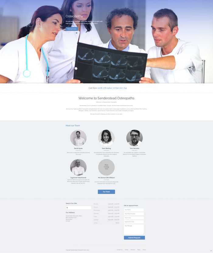
Sanderstead Osteopaths
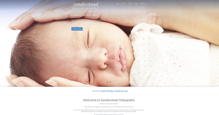
Website and logo for Sanderstead Osteopaths
My client required a clean, modern website to appeal to a target audience that needed Osteopathy. The website needed to look a little bit clinical, so we went with a slightly medical look using blue colours and photos that fitted that style. My client didn’t want to spend alot of money on a logo, so we just went for a simple text logo to go with the style of the website. Built using WordPress. The sister company is Natural Therapies clinic which can be seen to have a similar look and feel to Sanderstead.
- CLIENT Dave Ayres
- YEAR 2014
- CATEGORY Branding , Digital Design
- TAGS
